I have spent my holidays in Santa Maria di Castellabate; an awesome small city on the sea in the Cilento area.
Wonderful vacation.
Even if I was on holiday, I was not able to disconnect from my work at Sketchin and I was looking at my experience as a tourist from a professional standpoint.
I ended up with two good stories on service design on my notebook. One will talk about bad service design, and the other about good service design. This post is the one about bad service design, and it’s about trash cans.
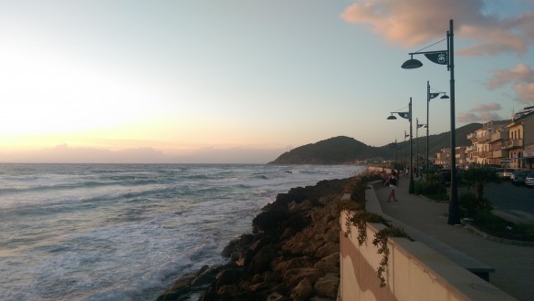
As you can see from the picture below, Santa Maria di Castellabbate is an awesome city. Our hotel was just a few steps away from the seaside and in less than a minute we were able to enjoy the wonderful Tyrrhenian sea.
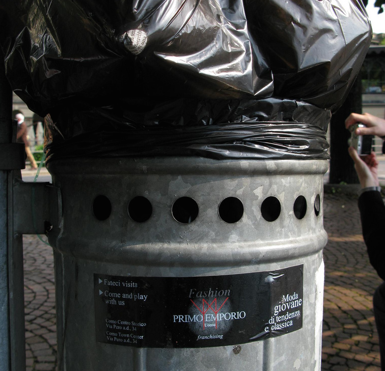
Each day we walked from the hotel to the beach and near to the stairs leading to the beach there was a trash can. Yes, the usual trash can you find in every urban landscape, and very similar to the one you can see in the featured image of this post. The municipality distributed the trash cans along the promenade every 300 meters or so. That’s a very good idea, isn’t it?
Sure it is!
I noticed that each morning the trash can was empty, and I become a little bit obsessed with trash cans. I noticed that each morning a small refuse lorry stopped by and emptied the trash can. A man walked out of the truck, emptied the trash can, and changed the garbage bag. Each single trash can on the promenade was processed like this.
Excellent service!
Yes, but…
Each evening walking back from the beach to the hotel sometime around five o’clock I noticed that the trash can was full, and people dropped their garbage all around the trash can. If you look again at the picture of the promenade, you can imagine that it’s not nice looking. It’s horrible!
All the trash cans were beautifully design and crafted. Built in cast iron with the municipality logo on their side. They are not inexpensive I guess, and the municipality must have spent a reasonable amount of money to buy them.
Here come service design and user experience.
I’m pretty much sure that they didn’t do any kind of user research on how people would use trash cans. Who would spend money on trash can user experience? Nobody.
Well, they should have done it.
They would have discovered how people uses trash can near to the beach and in which time they are used and filled. They would have understood that the size of the trash can was simply wrong, even if perfectly designed from an industrial design standpoint.
A bigger trash can would have reduced the amount of garbage around it in the evening. That point in time where people usually starts walking on the promenade enjoying the sunset. That would have increased the user experience of the tourist.
At the same time, a bigger trash can may even reduce the time between garbage pickups reducing operations cost for the municipality.
A few more considerations:
- I guess that the municipality just needed to buy trash cans. They just bought what the supplier offered them without any considerations on the use or capacity. This goes down to the “we always done that way” problem that we discussed in another post a while ago.
- The process has not been optimised. They collect trash as they always did in the past.
- The looked at the process from a pure company perspective and not from a end user perspective. Even with wrong trash cans simply moving the collection a few hours ahead would have helped.
One again we can notice how service design and user experience may have an impact on business and operations.
Yes, trash cans really matter!
Original photo by Cristina Corti – Original Photo

